Although Earth’s climate is currently changing rapidly relative to past changes, in most regions where we live changes are slow enough that we do not notice them directly during our daily lives. However, older people may have noticed changes during their lifetimes and in some regions changes are larger and more obvious than elsewhere. In this chapter we will discuss some observations from the past 100 years and data from regions that are particularly sensitive to climate change, where the most dramatic effects have occurred. This will not be a comprehensive documentation of existing observations. Additional observations will be discussed throughout the remainder of this book.
a) Atmosphere
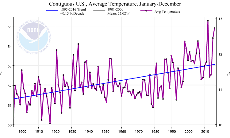
Observations show that climate is changing on a global scale. Surface air temperature data, averaged over the whole Earth, indicate warming of about 1°C over the last ~100 years (Fig. 1). But that warming was neither steady nor smooth. From 1880 to about 1910 there was cooling, followed by warming until about 1940. After this slight cooling or approximately constant temperatures were observed until the 1970s, followed by a rapid warming until the present. Each year’s temperature is somewhat different from the next. Not all of these year-to-year changes are currently understood, but natural variations, which are not caused by humans, do play a role. For instance, strong El Niño years such as 1997-98 or 2015 show up as particularly warm years, whereas La Niña years such as 1999-2000 or 2011 show up as relatively cool. El Niño and La Niña, also known as ENSO (El Niño/Southern Oscillation), is climate variability in the tropical Pacific that impacts many other regions of the Earth.

Explore Temperature Data
Go to NOAA’s Climate at a Glance website to explore their global temperature data. Select “annual” to get the annual averages. Now list the 20 warmest years by clicking on the ANOMALY column in the table below until you have the warmest year listed on top.
- Which is the record warmest year?
- How many of the 20 warmest years have occurred since the year 2000?
Click on the “Display Trend” button and enter different start and end dates.
- What is the trend over the last 50 (last 100) years?
Interested in how temperature measurements from long ago have been recorded? Have a look at this fascinating interactive article.
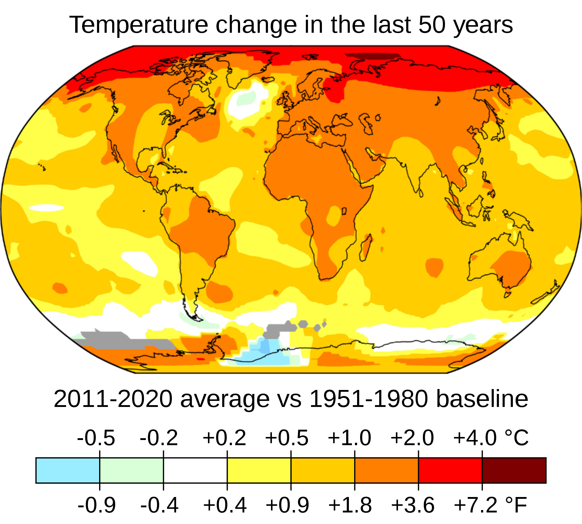
The increase in atmospheric temperatures over the last 100 years has not been uniform everywhere. Fig. 2 shows that temperatures over land changed more than over the oceans and the Arctic warmed more than the tropics. These patterns are called land-sea contrast and polar amplification and are quite well understood and simulated in climate models as we will see later. The warming is indeed almost global. The only exception is the northern North Atlantic, which has been slightly cooling for reasons we will discuss later.
Analysis of thousands of temperature records into an estimate of global mean temperature change such as Fig. 1 is not trivial. Issues such as changes in station locations, instrumentation and data coverage have to be taken into account. The fact that five different groups analyzing the data using different methods come to the same conclusions suggests that the results are robust. The reliability of the data has been demonstrated and it has been shown that station locations (e.g. urban versus rural) don’t matter. See this blog for more discussion.
The global warming trend has made the probability of warm and extreme warm temperatures more likely and the probability of cold and extreme cold temperatures less likely. E.g. extremely warm (more than 3°C warmer than the 1951 to 1980 average) summer temperatures over Northern Hemisphere land areas had only a 0.1% chance of happening from 1951 to 1980, whereas during the decade from 2005 to 2015 the chance of those extreme warm temperatures to occur was 14.5%. Conversely, relatively cold summer temperatures (less than 0.5°C cooler than the 1951-1980 average) that happened about every third year from 1951 to 1980 only occurred 5% of the time during 2005 to 2015. See this article and this blog for additional information and graphs.
b) Cryosphere
One of the most sensitive regions to climate change is the Arctic. Sea ice cover there has decreased dramatically over the past 40 years particularly in late summer (Fig. 3). Arctic sea ice experiences a strong seasonal cycle. In late winter it covers about 15.4×10⁶ km2 and decreases to about 6.4×10⁶ km2 in late summer (Fig. 4). Therefore, the relative changes are larger in late summer, with a reduction of about 46 % or 2.9×10⁶ km2 from 1980 to 2015. In winter the reduction was only about 9 % or 1.5×10⁶ km2. The lost area of summer Arctic sea ice is more than 10 times the size of Oregon (255,000 km2) or four times the size of France (~650,000 km2).
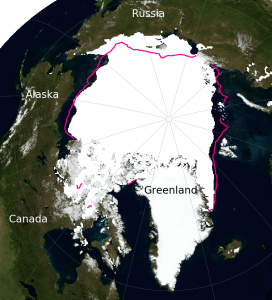
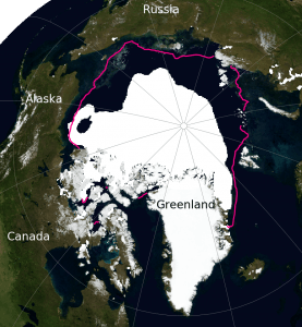
Figure 3: Arctic sea ice extent in September 1979 (left) and 2020 (right) from satellite observations. The purple line denotes the median ice extent from 1981-2010. In 1979 the ice extent was 7.1 million sq km, in 2020 it was 3.9 million sq km. Images from the National Snow and Ice Data Center (NSIDC).
In the Antarctic, sea ice experiences an even larger seasonal cycle but it has changed less over the last 40 years compared to the Arctic. Southern hemisphere sea ice has slightly increased. Note that year-to-year fluctuations are larger Antarctic than in the Arctic, whereas the long term trends in the Antarctic are much smaller than in the Arctic. This combination of larger short-term fluctuations and a smaller long-term trend makes Antarctic sea ice trends less statistically significant. A trend is statistically significant if it is larger than the uncertainties from short term fluctuations.

Globally, Earth has lost about 2 million square kilometers of sea ice from 1980 to 2015, which is about 10% of the total. Compare that area to that of your favorite state or country.
Explore Sea Ice Changes
Go to the National Snow and Ice Data Center’s (NSIDC) website and click on a few years to see how Arctic sea ice cover has changed over the year. To get a time series for the current month go to their sea ice index site and click on the Monthly Sea Ice Extent Anomaly Graph in the lower right corner.
- By how much has the sea ice cover decreased since the 1980s? Estimate the decrease both in relative terms (percentage) and in absolute terms (million square kilometers).
An animation is available here.
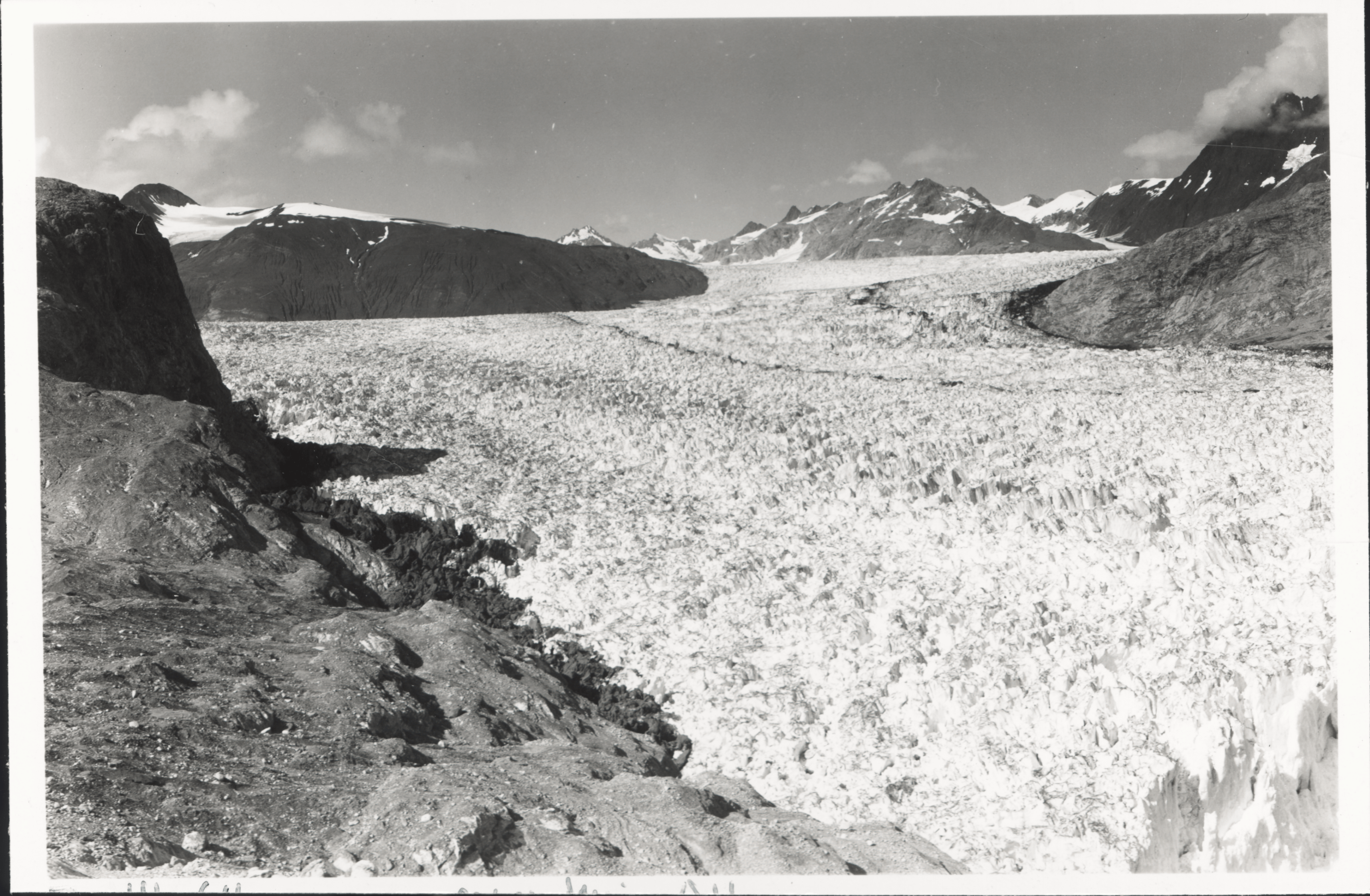
Mountain glaciers are also sensitive to climate change. Fig. 5 shows an example from Muir Glacier, which has retreated dramatically since 1941. This is typical for most glaciers around the world. In fact, only a small number of glaciers show advances, whereas the vast majority of glaciers melt and retreat from the valleys up into higher elevations.
 |
|
Figure 5: Muir Glacier in Glacier Bay National Park and Preserve, Alaska. The picture on top is from 1941, that on the bottom from 2004. From the National Snow and Ice Data Center (NSIDC).
|

The World Glacier Monitoring Service (WGMS) has compiled information on hundreds of glaciers world-wide. Fig. 6 shows that since 1980 glaciers in all regions have been losing mass with an acceleration of loss in recent years. Watch this video of glacier changes in Iceland.

Explore Glacier and Ice Sheet Change
Go to the Glacier Browser and select a glacier of your choice.
- What do you observe?
Explore Greenland ice sheet change with this interactive chart, which shows the surface area experiencing melting. Click on a few years in the early part of the record (e.g. 1980s) and in the more recent part (e.g. 2010s).
- How has the melt area changed?
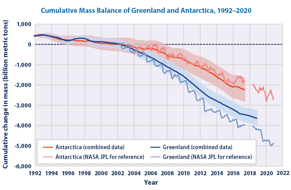
Ice sheets are also melting. Observations from the Gravity Recovery and Climate Experiment (GRACE) satellites, which measure very precisely Earth’s gravity field and can detect changes in mass, show that since 2002 the Greenland ice sheet has lost about 4,000 Gt of mass, and the Antarctic ice sheet has lost about 2,500 Gt (Fig. 7). Here is a presentation about Greenland melting. Melting of the Greenland ice sheet contributes currently about 0.8 mm/yr to global sea level rise. Antarctica’s contribution is 0.4 mm/yr and mountain glaciers add about 0.6 mm/yr, for a total of 1.8 mm/yr sea level rise from melting of ice (IPCC 2019).
Box 1: Rates of Change
The rate of change of a variable X between two points in time t1 and t2 can be calculated as the difference (denoted by the greek letter delta Δ) of the value of the variable at time t2 minus the value of the variable at time t1 ΔX = X2 – X1 divided by the difference in time Δt = t2 – t1
(B1.1) 
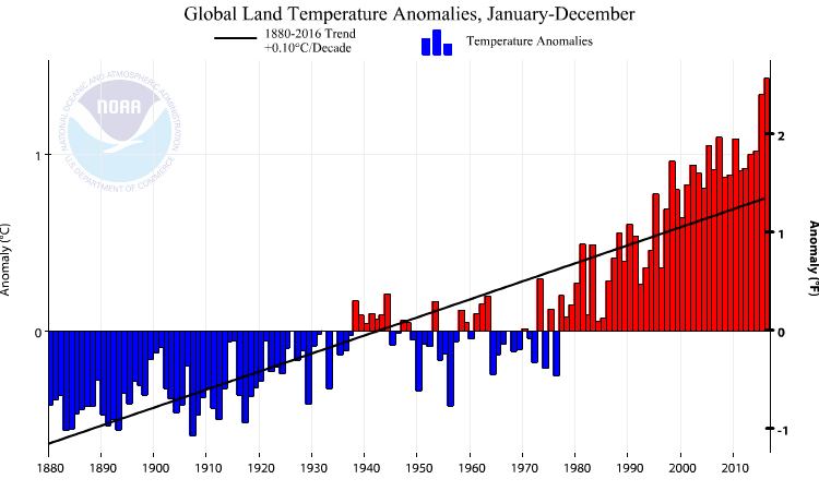
Thus the units of the rate of change are the units of the variable divided by time. You can determine the rate of change from a timeseries graph such as Fig. 1 or Fig. 6 by selecting two points in time on the horizontal axis and reading the corresponding values of X1 and X2 from the vertical axis. Using Fig. 1 as an example our variable will be the temperature anomaly T. Choosing t1 = 1940 and t2 = 2010 we can read off T1 = 0ºC and T2 = 0.7ºC. Thus, ΔT = 0.7ºC, Δt = 70 years and the rate of change ΔT /Δt = 0.01ºC/yr = 0.1ºC/decade.
Obviously, calculating the rate of change in this way the resulting value will depend on the two times picked. The rate of change of a whole set of data points can be calculated by assuming a linear relationship and minimizing the distance of all points from a straight line X = S×t + I, where S is the slope and I the intercept with the vertical axis. This is called linear regression. Simple formulae to calculate S and I can be found here. Linear regressions are commonly used to estimate rates of change. E.g. the straight lines in Fig. 4 in this chapter and Figs. 7-12 in chapter 1 have been calculated using the formulae for linear regression. Regression lines are also often referred to as trend lines.
c) Ocean
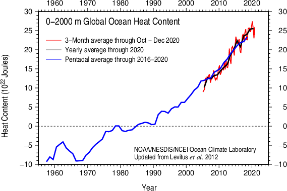
Subsurface temperature measurements in the oceans document warming over the last 60 years (Fig. 8). The ocean’s heat content has increased by about 30×1022 Joules during that time. The heat content of the ocean is its temperature Ttimes the heat capacity of water cp= 4.2 J/(gK). Prior to 2005 subsurface temperature measurements were more limited in space and time because they were taken from ships by lowering CTD(conductivity, temperature, depth) instruments on a cable into the ocean. Since 2005 autonomous, free-drifting Argofloats measure temperature, salinity, pressure, and velocity of the upper 2 km of the water column. Currently there are about 4,000 floats out there, which provide much better spatial and temporal coverage than the previous ship-based measurements.
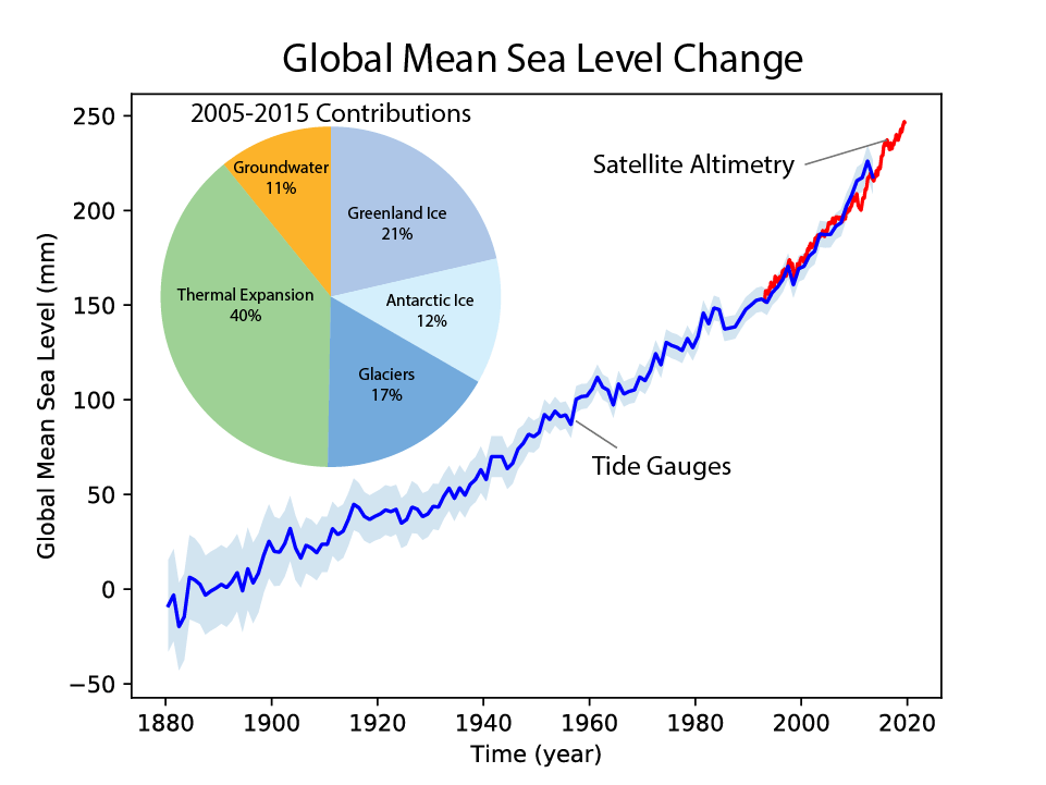
The melting of mountain glaciers and ice sheets leads to increased runoff into the ocean, which contributes to sea level rise (Fig. 9). Sea level rise is also caused by warming sea water, which causes expansion and by increased runoff from pumping of groundwater out of aquifers. Estimates based on tide gauge records indicate that sea level has risen by about 20 cm from the 1870s to the year 2000 and another 6 cm since. The melting of mountain glaciers and ice sheets contributes about similarly to the current sea level rise, but if current trends continue it is likely that many mountain glaciers will completely disappear and the large ice sheets will contribute more and more to global sea level rise. Note that sea level rise is not spatially uniform.
Explore Sea Level Changes
Goto noaa.gov and explore local sea level changes from tide gauges.
- Where is sea level increasing?
- Where is it decreasing?
- Select a tide gauge. What is the time period covered?
Here is a map of sea level measured from satellites.
- What time period is covered by the satellite data?
- Where is sea level increasing?
- Where is it decreasing?
d) Biosphere and Carbon Cycle
Plant and animal species have been observed to move poleward and upward in the mountains (Parmesan and Yohe (2003). This response is consistent with global warming and the tendency of organisms to stay in a temperature range to which they have adapted. Flowering dates of many plants have also shifted earlier in the spring such as for cherry blossoms.
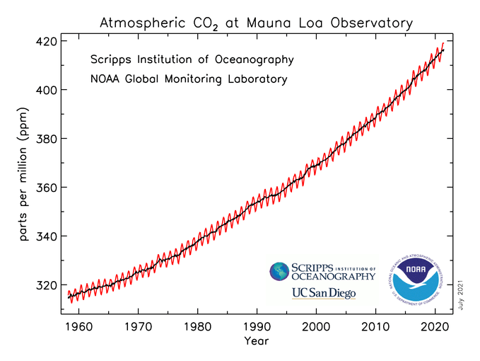
Carbon dioxide (CO2) has been measured in the atmosphere since 1958 at Mauna Loa Observatory in Hawaii (Fig. 10). At that time concentrations were just below 320 parts per million (ppm). Subsequently they increased to values of just over 400 ppm today. That is a 25 % increase. Overlaid on the long term trend is a seasonal cycle. Growth of the terrestrial biosphere in northern hemisphere spring leads to CO2 drawdown and decay of organic matter such as fallen leaves increases CO2 in the fall. As we will see later, CO2 is an important greenhouse gas, and its increase over the past decades is the main cause of the recent global warming.