16.1: The Value of Sensory Enhancements
16.1.1: Improve Listener Engagement, Comprehension, and Memory
Sensory enhancements may help your audience to become more engaged and to better understand and remember your presentation.
Learning Objective
Discuss how sensory enhancements can improve listener engagement, comprehension, and memory
Key Points
- Listeners will be more engaged if you tailor your sensory enhancements to them and add value with pictures, graphs, and other visually appealing items.
- Sensory enhancements improve comprehension through the process of repeating the information both visually and audibly.
- The repetition of information through a sensory enhancement and in your speech will help the audience remember your presentation.
Key Term
- engage
-
To engross or hold the attention of (someone); to keep busy or occupied.
Example
- Engage your audience by taking into account their goals and motivations. For example, the details that you share about an organization’s financial status will differ depending on whether your audience is a tax inspector, an external auditor, the community of beneficiaries or the new employees.
Improving engagement, comprehension, and memory of your presentation can be accomplished by using sensory enhancements, or visual aids. Sensory enhancements allow the audience members to break up the presentation into memorable chunks that are more easily understood than if the presentation had not included visual aids.
Improving Listener Engagement through Sensory Enhancements
- Listeners will be more engaged if you understand your audience and tailor your sensory enhancements to them. For example, if you are presenting to a group that may have a shorter attention span, such as teenagers or young adults, you will want to use sensory enhancements with pictures and colors rather than additional text.
- Visual aids help audience members follow the structure and flow of your presentation. They will also help audience members pay attention, as it is easier to engage with visuals rather than simply with words .
- Use engaging anecdotes, quotes, and examples as a part of your visual aid. Stories and quotes help to break up your presentation, and will also help audience members to maintain their engagement in your presentation. Outlining these stories in your visual aids will help the audience remember and apply these stories.
Improving Listener Comprehension through Repetition and Sensory Enhancements
Listener comprehension can be greatly improved through repetition, as it allows the audience to mentally rehearse and process information a second time, both visually and audibly. This is most effective when a sensory enhancement is used as a method of repeating an idea. For example, if a speaker uses a story to explain a concept and has a visual aid related to the story, the audience member will process both the visual aid and the story, and will be more likely to understand the concepts the speaker is presenting.
Improving Listener Memory through Sensory Enhancements
Sensory enhancements are also a powerful way of enhancing the memory of your audience. This is accomplished through the repetition of the information presented to the audience member. If a speaker discusses the idea and then uses a visual aid to help the audience understand that idea, the audience member will think about and process this idea twice rather than just once. This will result in the audience member being more likely to remember the idea. Similarly, a visual aid will act as a cue for the audience to remember a story or concept that the speaker is explaining. The visual cue will more easily remind the audience of the concept than a simple explanation in words.

Making an Impression
Graphs, images, and other sensory enhancements help the audience to understand and remember a presentation.
16.1.2: Choosing the Right Visual Aid
One way to make your presentation memorable is through the use of visual aids; select aids that are appropriate to the point that you wish to illustrate.
Learning Objective
Discuss how to choose the appropriate visual aid for presentations
Key Points
- Visual aids should support, clarify, and amplify, not repeat what you are saying. In order to make sure that the intent of your visual aid is clear try to use only important or memorable words or phrases.
- It is important to consider if your visual can be seen and understood by the member of your audience who is farthest from the screen when choosing to use it. In order to do this test out your visual aids in different environments.
- Visual Communication relies on vision, and is primarily presented or expressed with two dimensional images. A visual message accompanying text has a greater power to inform, educate, or persuade a person or audience.
Key Term
- Visual Communication
-
The communication through visual aid and the conveyance of ideas and information in forms that can be read or looked upon.
Example
- Avoid passing hard copies of your visual aids around to the audience. Do try to provide interactive aspects into your visual aids that involve the audience such as polls, feedback requests, and interactive activities.
Choosing the Right Visual Aid
Visual Communication relies on vision, and is primarily presented or expressed with two dimensional images. These may include the following:
- Typography
- Drawing
- Graphic design
- Illustration
- Color
- Electronic resources
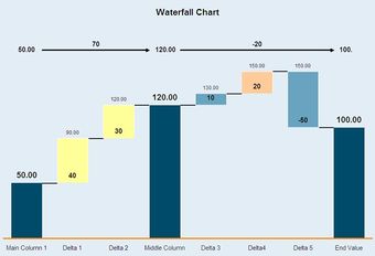
Using Visual Aids
A chart is an example of a visual aid that a speaker can use during a speech.
It also explores the idea that a visual message accompanying text has a greater power to inform, educate, or persuade a person or audience. One way to make your presentation vivid and memorable is through the use of visual aids. Although computer generated and projected visual—and presentation—aids are commonly used, it is still important to understand how to use them or any other type of visual aids in your presentation.
There are many different types of visual aids. The type of visual aid a speaker uses depends on his preference and the information he is trying to present. In order to determine the type of visual aid to use, begin by writing your outline first, focusing on the main points of your presentation and taking into consideration your audience and any cultural contexts. Select visual aids that are appropriate to the point that you wish to illustrate or clarify. Visual aids should support, clarify, and amplify, not repeat what you are saying. In order to make sure that the intent of your visual aid is clear, try to use only important or memorable words or phrases. For example, eliminate any unnecessary word slides or overcrowding of visual aids. Pictorial slides and appropriate color usage have the biggest impact.
It is important to consider if your visual aid can be seen and understood by the member of your audience who is farthest from the screen when choosing to use it. In order to do this, test out your visual aids in different environments. Practice with your visual aid when going through your presentation for timing and familiarity. Try to avoid beginning or ending your presentation with a visual aid unless it is key in opening your presentation or making a significant point. Introduce visual aids so that they blend smoothly with your speech and highlight your main points or provide clarity to examples. It is important to maintain eye contact; talk to your audience, not the visual aid throughout your presentation. Practice going through your presentation and coordinating your points with your visual aids when discussing them. Avoid passing hard copies of your visual aids around to the audience as it is often a distraction. Do try to provide interactive aspects into your visual aids that involve the audience such as polls, feedback requests, and interactive activities.
Here are some examples of visual aids:
- Photographs
- Drawings or diagrams
- Graphs
- Display charts
- Video excerpts
16.1.3: The Importance of Preparation
Preparing and understanding your visual aids is essential to improving the engagement, understanding, and memory of your audience.
Learning Objective
Indicate what factors speakers should consider when selecting and preparing visual aids
Key Points
- In preparing your visual aids, you should consider three important components: Are your visual aids appropriate for your audience? Are your visual aids easy to understand and easy to read or view? Do you know what is on your visual aids and can you present them effectively?
- When creating a visual aid, make sure to consider the knowledge base, demographic background, occupation, and values of your audience.
- Be sure to use text that is large enough (size 16 point font is a suggested minimum) and colors that do not conflict with one another. This ensures that words are legible.
- An essential component of using visual aids effectively is to prepare yourself in understanding what is on them and determining how you want to explain them.
Key Term
- demographic
-
A characteristic used to classify people for statistical purposes, such as age, race, or gender.
Example
- Make sure to consider the knowledge base, demographic background, occupation, and values of your audience when creating a visual aid. For example, you may not want to use examples and images that one generation or age group may not understand.
Appropriate preparation of your visual aids is essential in making sure that they are effective in helping to improve the engagement, memory, and comprehension of your audience. In preparing your visual aids, you should consider three important components:
- Are your visual aids appropriate for your audience?
- Are your visual aids easy to understand and easy to read or view?
- Do you know what is on your visual aids and can you present them effectively?
Are your visual aids appropriate for your audience?
Once your topic has been decided upon and your research is underway, it’s time to think about how you plan to present your information in visual aids. Of the several angles that need to be addressed in regards to delivering a speech, the most important thing to keep in mind is, “Who is my audience? ” Never underestimate the importance of knowing your audience. If your audience can’t understand your visuals, you’ll find it much harder to accomplish your objective.
Make sure to consider the knowledge base, demographic background, occupation, and values of your audience when creating a visual aid. For example, you may not want to use examples and images that one generation or age group may not understand. Your decision to use visual aids such as PowerPoint, charts, or any kind of demonstrative props will have a sizable impact on your audience, so they should be given careful thought.
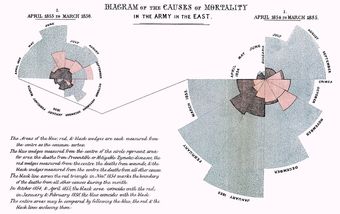
Choosing Visual Aids
The speaker should carefully select visual aids that are relevant to the topic and the audience.
Are your visual aids easy to understand and easy to read or view?
When you are preparing your visual aids, you should make sure that your audience will be able to read and understand what they are saying. Be sure to use text that is large enough (size 16 point font is a suggested minimum) and colors that do not conflict with one another. This ensures that words are legible. Make sure that any photos, charts, and diagrams are easily understood within the first few seconds of looking at them. If they are not easily understood, be sure to spend time during your presentation explaining what the photos or charts mean.
Additionally, one way to make sure that people in the back of the presentation can read your visual aids is to print off a full page slide of your presentation, place it on the floor and stand up and see if you can read the entire slide. If you cannot read it, people in the back of the room during your presentation will also likely not be able to read your slide. One other consideration is to be sure that you are comfortable using any technology that you will use to assist the presentation of your visual aids. You must also make sure that the location of your presentation has this working technology available to you.
Do you know what is on your visual aids and can you present them effectively?
An essential component of using visual aids effectively is to prepare yourself in understanding what is on them and determining how you want to explain them. If you are using pictures, graphs, or charts to help you explain a point, be sure that you understand the graph or picture and you are comfortable explaining this to an audience. If you are confused about a graph during your presentation, or do not do an adequate job of explaining a graph, your audience will also likely be confused about the graph as well. Such confusion will detract from audience engagement and comprehension.
Before you present, go through your graph, charts, and pictures. In your notes, write where each visual aid is presented in your presentation, what they mean, and how you plan to present them. Be sure to rehearse this before your presentation so your visual aids can be as effective in helping your audience be engaged, understand your presentation, and remember your key points.
16.2: Types of Sensory Enhancements
16.2.1: Physical Objects and Animations
Physical and animate objects can help to integrate the verbal and visual elements of a presentation into one unified message.
Learning Objective
Indicate when using physical and animate objects is appropriate in presentations
Key Points
- Choosing the appropriate object for a presentation depends on the speaker’s preference, as well as the content and setting of the presentation.
- Ultimately, objects should enhance rather than detract from a presentation.
- Using physical objects is often necessary when demonstrating how to do something so that the audience can fully understand the procedure or process.
Key Terms
- LCD
-
A flat panel display, electronic visual display, or video display that uses the light modulating properties of liquid crystals. Liquid crystals do not emit light directly.
- prop
-
An item placed on a stage or set to create a scene or scenario in which actors perform. Contraction of “property”.
Physical and Animate Objects
In today’s media-driven world, public speakers have a plethora of visual aids to choose from when augmenting their presentations. From LCD projections to flip charts, visual aids help presenters inform and persuade audiences, as well as help them understand the presentation topic. Physical and animate objects can also help integrate the verbal and visual elements of the speaker’s presentation into one unified and memorable message.

Using Objects
Physical and animate objects can help audiences better understand the topics being presented.
Objects as Visual Aids
Ultimately, objects should enhance rather than detract from a presentation. The use of objects as visual aids involves using actual objects as live demonstrations or props for the audience. For example, a speech about tying knots would be more effective by bringing a rope. Using physical objects is often necessary when demonstrating how to do something so that the audience can fully understand the procedure or process.
The use of physical and animate objects in formal presentations is the same as in stage acting where actors use still and animated props. For the objects to be as effective as possible, they must be positioned in a way where they are quickly detected and easily understood by the audience. A common mistake involves placing an object where it is obstructed or hidden from view, or in front of a more interesting object that divides the audience’s attention. Speakers must also be cognizant of objects that are too large or inconvenient for stage use.
Choosing Objects for Presentations
There are many physical and animate objects available for presentations. Choosing the appropriate visual aids depends on the speaker’s preference, as well as the content and setting of the presentation. Objects can be both beneficial or distracting during speeches. Therefore, presenters should prepare and plan ahead accordingly to ensure that objects are appropriate for the audience and material being presented.
16.2.2: Chalkboards, Flip Charts, and Transparencies
Visual aids including chalkboards, flipcharts, and transparencies help presenters weave words and images together into a cohesive message.
Learning Objective
Distinguish between the use of chalkboards, dry boards, whiteboards and flipcharts during presentations
Key Points
- While chalkboards are typically used in academic settings, universities and organizations employ dry boards for presentations and record-keeping.
- Chalkboards, dry boards, and flipcharts allow for fast, simple and easy use by presenters who may not be familiar or comfortable with presentation software tools.
- Transparencies are used across a wide variety of organizations, allowing for easy note-taking and steady eye contact during presentations.
- Despite its heavy use in academia, transparencies are quickly becoming outdated and being replaced by computer-based presentation tools.
Key Term
- transparency
-
specifically, a transparent material with an image on it, that is viewable by shining light through it.
Chalkboards, Flipcharts, and Transparencies
Visual aids such as chalkboards, flipcharts, and transparencies are used by presenters to help weave their words and images together into a cohesive message. Using visual tools effectively during a presentation helps speakers appear prepared, professional, interesting, and credible. Writing tools and imagery also help audience members focus on and remember the presenter’s major points, as well as better understand the presenter’s argument.
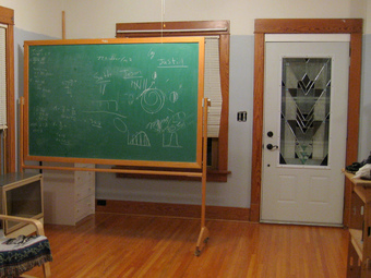
Choosing Visual Aids
Modern chalkboards are often made with green slate stone so that the writing is easier to read.
Chalkboards: From School to the Workplace
Although we often think of chalkboards in academic or teaching settings, chalkboards (or dry boards) are also commonly used in business environments. Chalkboards are reusable writing surfaces where text and drawings are made using sticks of calcium sulfate or calcium carbonate known as chalk. Chalkboards were originally made of smooth, thin sheets of black or dark grey slate stone. Modern versions are often green because the color is considered easier for reading.
Organizations typically use dry boards, which use dry erase markers for easy application and removal. These boards can be used for presentations, as well as advertisements or record-keeping.
In presentations, chalkboards and dry boards provide significant flexibility for recording audience responses and jumpstarting discussions. This spontaneity allows for fast, simple and easy use by presenters who may not be familiar or comfortable with presentation software tools.
On the other hand, writing on a chalkboard or dry board can delay presentations. Presenters may be tempted to speak to the board instead of the audience. Also, the chalkboard’s size limits visibility for large groups. Presenters with poor spelling or illegible handwriting can also pose problems for audience members.
Flipcharts in Presentations
Like chalkboards and dry boards, flipcharts have a low learning curve, allowing anyone with the ability to write to quickly convey information to audience members. Flipcharts are typically stationary items consisting of pads of large paper sheets fixed to the upper edge of a whiteboard. These are typically supported on a tripod or four-legged easel. Invented by Peter Kent, who built one to help him in a presentation, flipcharts are commonly used for presentations.
Flipcharts come in various forms, including:
- Stand-alone flipcharts
- Metallic tripod (or easel) stands
- Metallic mounts on wheels
Recently, scientists have developed a digital self-writing flipchart which writes word-for-word everything it is instructed to record. Self-heightening flipcharts such as the POGO system are also being introduced into public use. However, traditional flipcharts where text is usually hand-written with marker pens are still widely used in organizations.
Transparencies in Business, Academia, and the Church
In today’s information age, digital presentations and slideshows are by far some of the most widely used visual aids in public speaking. However, transparencies are still used by a variety of organizations. A transparency, also known in industrial settings as a “viewfoil” or “foil”, is a thin sheet of transparent flexible material, typically cellulose acetate, onto which figures can be drawn. These are then placed on an overhead projector to display to an audience.
Many companies and small organizations use a system of projectors and transparencies in meetings and other groupings of people; though this system is being largely replaced by LCD projectors and interactive whiteboards. In academia, mathematics and history classes traditionally used transparencies to illustrate a point or problem. Math classes in particular used a roll of acetate to illustrate sufficiently long problems and create illustrations that were difficult to do on computers due to a lack of math symbols on standard computer keyboards.
Nevertheless, more colleges are switching to digital projectors and PowerPoint presentations. In churches and other religious organizations, religious leaders used transparencies to show sermon outlines and illustrate certain topics such as Old Testament battles and Jewish artifacts during worship services.
While transparencies allow presenters to maintain eye contact with the audience, and multitask (e.g. take notes), they often appear plain looking with no motion or sound. Moreover, transparencies must be shown in dim lighting, which may potentially cause visibility problems for viewers. As a result, overhead projectors are quickly becoming outdated and being replaced by computer-based presentation tools.
16.2.3: Static Representations: Images, Drawings, and Graphs
Physical cues such as images can help to reinforce a speaker’s message.
Learning Objective
Discuss the appropriate placement of images, graphs, and drawings in presentations
Key Points
- Static imagery can either serve as a useful visual tool to further emphasize or support a speaker’s point, or confuse audiences and detract from the speaker’s message.
- Photographs, maps, and handouts are all examples of visual aids that employ static imagery.
- Bar graphs, line graphs, and other types of graphs are used in both static and electronic presentations to visualize relationships between different quantities.
- Drawings or diagrams can be used when photographs do not show exactly what the speaker wants to show or explain.
Key Term
- typography
-
The appearance and style of typeset matter.
Static Presentations: Images, Drawings, and Graphs
Visual communication, as the name suggests, conveys ideas and information in forms that can be read or looked upon. Audiences partially rely on vision to receive a speaker’s message, using physical cues, signs, typography, drawing, graphic design, illustration, color, and electronic resources. Public speakers often employ a variety of presentation tools—including drawings, paintings, and graphs—to inform, educate or persuade a person or audience. Although static in nature, non-electronic imagery has both advantages and disadvantages when used as visual aids in presentations.
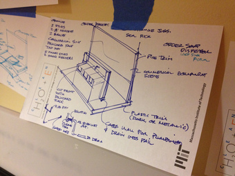
Drawings
Drawings can be used in place of complex or detailed photographs.
The Many Uses of Images in Presentations
Images can be any two-dimensional figure such as a map, a graph, a pie chart, or an abstract painting. In this wider sense, images can also be rendered manually (e.g., by drawing, painting, carving) or automatically (e.g., by printing, computer graphics technology). Static images such as photographs, paintings, and illustrations can serve as useful visual tools to further emphasize or support a speaker’s point. However, if the images appear unrealistic, too small, or confusing, they can hinder the presentation and dilute the speaker’s message.
Examples of static images used in presentations include:
Photographs – Photographs are helpful tools to make or emphasize a point, or to explain a topic when the actual object cannot be viewed. For example, photographs are particularly useful for displaying historical places and sites that no longer exist.
Maps – Maps show geographical areas of interest. They are often used as aids when speaking of differences between geographical areas or showing the location of something.
Handouts – Charts, graphs, pictures, illustrations, and other images can be printed on handouts for distribution before, during, or after a presentation. An important aspect of the use of a handout is that a person can keep the handout long after the presentation is over. This helps the person better remember what was discussed.
Graphs and Data
Graphs are used in both static and electronic presentations to visualize relationships between different quantities. Various types of graphs are used as visual aids, including bar graphs, line graphs, pie graphs, and scatter plots. Graphs are particularly helpful for visualizing statistics that might be overlooked if just presented verbally. However, it is graphs’ complexity—detailed calculations, complex data and large figures—that cause them to become cluttered during use in a speech. Graphs often include too much detail, overwhelming the audience and making the graph ineffective.
Drawings in Presentations
Drawings or diagrams can be used when photographs do not show exactly what the speaker wants to show or explain. It could also be used when a photograph is too detailed. For example, a drawing or diagram of the circulatory system throughout the body is a lot more effective than a picture of a cadaver showing the circulatory system.
Nevertheless, talent and skills are usually needed for professional drawings that require significant detail or realism. If not done correctly, drawings can look sloppy, be ineffective, and appear unprofessional.
16.2.4: Dynamic Representations: Video and Multimedia
For speakers, multimedia allows dynamic customization and increased chances for audience engagement during presentations.
Learning Objective
Illustrate how multimedia tools can enhance audiences’ experience
Key Points
- Presenters may use navigation devices such as text links, picture thumbnails, or miniature screenshots to move around spontaneously within and between large collections of interconnected content.
- Although studies have revealed that audiences are more engaged during presentations that employ dynamic elements, there have been no assessments as to whether using multimedia improves learning and retention of presentation material.
- Multimedia such as video enhances the experience of the audience member, and can help presenters convey information more easily and quickly than static presentations.
- Integrating multimedia with online applications and hardware elements can ease the job of presenters by adding emphasis and bringing attention to specific points in the presentation.
Key Term
- multimedia
-
The use of different media to convey information; text together with audio, graphics and animation, often packaged on CD-ROM with links to the Internet.
Dynamic Representations: Video and Multimedia
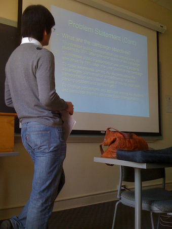
Presenters may use navigation devices such as text links, picture thumbnails, or miniature screenshots to move around spontaneously within and between large collections of interconnected content. Using these relational presentation techniques allows presenters to interact with rather than “talk at” audiences .
Multimedia in Presentations
Presenters often use multimedia in presentations to make the content more engaging for audiences.
Audience Reception of Dynamic Content
Although studies have revealed that audiences are more engaged during presentations that employ dynamic elements, there have been no assessments as to whether using multimedia improves learning and retention of presentation material. Regardless of whether speakers use static or dynamic content, all presentations must present consistent and compelling information within a limited time frame. The various formats of technological or digital multimedia available to presenters may be intended to enhance the users’ experience, quickly and easily convey information, or transcend everyday experiences.
Software Presentation Programs
Presentation software programs provide public speakers with the ability to display video, photography, and other dynamic content in slideshow formats suitable for small and large audiences. For example, Apple’s iPhoto allows groups of digital photos to be displayed in a slideshow with options including transitions, looping functions, and the integration of music and digital photos. Zooming presentation programs such as Prezi present content on one infinite canvas. This allows for non-linear presentations where presenters can present richer detail of content, as well as provide a better overview and understanding of complex visual messages and relations.
Multimedia Tools in Presentation Software
Many presentation programs come with pre-designed images (clip art) and/or have the ability to import graphic images. Some tools also have the ability to search and import images from Flickr or Google directly from the tool. Custom graphics can also be created in other programs such as Adobe Photoshop or Adobe Illustrator and then exported.
Similar to programming extensions for an operating system or web browser, plugins for presentation programs can be used to enhance their capabilities. For example, it would be useful to export a PowerPoint presentation as a PDF document. This would make delivery through removable media or sharing over the Internet easier. Since PDF files are designed to be shared regardless of the platform, this format would allow presentations to be more widely accessible.
Certain presentation programs also offer an interactive, integrated hardware element designed to engage an audience (e.g., audience response systems) or facilitate presentations across different geographical locations (e.g., web conferencing). Integrated hardware devices such as laser pointers and interactive whiteboards can ease the job of the presenter by adding emphasis and bringing attention to specific points in the presentation.
16.2.5: Slideshows
A slideshow is an on-screen presentation of information and/or ideas presented using overhead projectors, photos, or presentation software.
Learning Objective
Explain how slideshows are used for personal and business purposes
Key Points
- Presentation software is most commonly used for instructional purposes, usually with the intention of creating a dynamic, audiovisual presentation.
- Before the introduction of motion pictures and computer software, slides originally were projected onto a theater screen via magic lanterns.
- In addition to business presentations, slideshows are used to provide dynamic imagery for museum presentations and installation art, and for saving personal memories as digital photo albums.
Key Terms
- annotation
-
The process of writing comments or commentary.
- phenomenological
-
Using the method of phenomenology, by which the observer examines the data without trying to provide an explanation of them.
- magic lantern
-
An early form of slide projector that could achieve simple animation by moving and merging images.
Slideshows
A slideshow is an on-screen presentation of information and/or ideas presented on slides. Since the late 1960s, visual artists in museums and galleries have used slideshows as a device for presenting specific information about an action or research, or as a phenomenological form in itself. Before the advent of motion pictures, slides originally were projected onto a theater screen by magic lanterns. This practice later evolved into moving picture shows .
Building a Slideshow
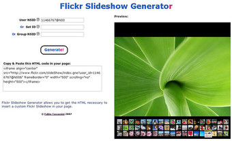
Consumers can use online programs such as Flickr to assemble photo slideshows.
Even after the introduction of motion pictures, slides continued to be used between film showings to advertise for local businesses or advise on theater decorum—for example, by requesting that gentlemen remove their hats and refrain from smoking, and urging mothers to remove crying infants from the auditorium.
Slideshows were later conducted using apparatuses such as a carousel slide or overhead projector. Most recently, modern slideshows are commonly assembled using presentation software such as Microsoft PowerPoint or Prezi.
Personal and Business Uses
Presentation software is most commonly used for instructional purposes, usually with the intention of creating a dynamic, audiovisual presentation. The relevant points and imagery of the entire presentation are placed on slides and accompanied by a spoken monologue. The old adage “a picture is worth a thousand words” holds true, in that a single image can save a presenter from speaking a paragraph of descriptive details. As with any public speaking or lecturing, a certain amount of talent, experience, and rehearsal is required to make a successful slideshow presentation.
Slideshows have artistic uses as well. They are often used to provide dynamic imagery for museum presentations and installation art. Consumer uses of slideshows include personal screensavers, and digital photo slides for display. Vendors or consumers can custom make slideshows using their using photos, music, wedding invitations, birth announcements, or other digital files. The slideshows are typically placed onto DVDs, converted into HD video format, or saved in an executable file for computer use. Ultimately, photo slideshow software—coupled with digital cameras and computer technology—has made it easier to create photo slideshows, eliminating the need for expensive color reversal film.
Common Slideshow Features
Photo slideshow software often provides a wide range of editing features. For example, users can add transitions, pan and zoom effects, video clips, background music, narrations, and captions.
Slideshows created using presentation software result in a file sometimes referred to as a “slide deck” or simply a “deck” in business settings. Some key features useful in desktop or cloud-based presentation software include screen capturing, image editing and annotation tools, and slide transition and text effects.
Web-based slideshows are slideshows that can be viewed or presented using a web browser. Some web-based slideshows are generated from presentation software, but may be difficult to modify. Others offer templates where slideshows can be easily edited and changed. Web-based slideshows are typically generated or authored in HTML, JavaScript, and CSS code (files). However, compared with desktop presentation programs, web-based slideshows are usually limited in features.
16.3: Preparing Sensory Enhancements
16.3.1: The Do’s of Using Sensory Enhancements
Using sensory enhancements correctly will make your presentation come to life.
Learning Objective
Discuss the best practices of using text, video, sound, graphics and animation in presentations
Key Points
- During your presentation, your audience will see you and your visual aids.
- It is important to pay attention to the quality of the text as well as what is actually said.
- Learners are attracted to colors and may find programs without color to be boring.
- Video is a great attention grabber but may distract the audience from more important information.
Key Terms
- color-blind
-
Of a person or animal, unable to distinguish between two or more primary colors (usually red and green).
- animation
-
The technique of making inanimate objects or drawings appear to move in motion pictures or computer graphics.
Introduction
When you give a presentation, you are truly alive, as being on stage activates all of your senses. You see your audience waiting to receive your wisdom. You hear the noise they make as they shift in their places. You smell the scent of success that accompanies a job well done. You taste the nervousness bubbling in your gut. You feel your heart beating faster, your legs shaking.
Shouldn’t your presentation make your audience come alive, too?
Sight
During your presentation, your audience will see you and any visual aids you may include.
You
The audience is going to have to look at you throughout the the entire presentation. You want to keep them engaged by:
- Dressing in a way that suits your personality (Could you imagine Steve Jobs giving a presentation wearing a suit and tie? )
- Wearing colors that suit the setting and appeal to the audience
- Showing confidence through your body movements (Even when Steve Jobs was speaking about iPhone 4 “defects,” you knew that he was in control)
- Using gestures that go with your message
Text
Some useful suggestions for using text as a video presentation are:
- Text should be read from left to right, top to bottom
- Use consistent indentation and spacing
- End sentences or paragraphs on the same display screen
Text Quality
According to Alessi and Trollip (2001), the five important factors that should be used in determining the quality of text are:
- Leanness: Say the bare minimum
- Transitions: Should be used when moving from one topic to another to facilitate the flow of ideas
- Clarity: Use language that is comprehensible by your target audience as well as consistent words for defining terms
- Reading level: Ensure that the reading level is suitable to the learners intended to use it
- Mechanics: Always remember to correct grammar, spelling and punctuation
Color
Color should draw attention to the important terms or concepts in your presentation. Color should be consistently used throughout the design of the presentation. Learners are more attracted to colors and may find programs without color to be boring.

Power of Color
Using color in a presentation catches the audience’s attention and highlights important facts.
One of the disadvantages of using color is that color-blind individuals may miss out on some information in certain colors.
Useful suggestions for using color:
- Be consistent with use of colors
- Use color to indicate a difference or change
- Try to keep color use to a minimum
- Make sure that there is a good contrast between the background and the color of the text to allow the audience to read it easily
Video
Video is a great attention grabber, but may distract the audience from more important information.
Here are some useful suggestions for using video:
- Use video to emphasize important information
- Pay careful attention to where video is placed in the presentation
- Make sure the length of the video is appropriate
- Ensure that you have control over the video as far as pausing, ending and repeating
Sound
Your voice can serve as a sensory enhancement. To make it effective:
- Add variety to your tone
- Speak loudly and clearly
- Use proper enunciation and pronunciation
If you use sound other than your own voice:
- Use sound as an attention grabber if it makes sense to do so
- Use high quality sound
Graphics and Animation
Graphics and animation should enhance the presentation.
Useful suggestions for using graphics and animation:
- Use graphics that are consistent throughout presentation
- Sometimes less is better
- Decide if a realistic picture is necessary or not
- Some graphics may need to be broken into smaller pictures
- When using text and graphics, present both simultaneously
An effective presentation or speech will touch your audience; an alive audience is likely to take action.
16.3.2: The Don’ts of Using Sensory Enhancements
Using visuals in presentations is a good way to make sure people remember them, but it is important to do so in the proper manner.
Learning Objective
Identify the common missteps presenters make when using sensory enhancements in presentations
Key Points
- According to research carried out at UCLA, a visual presentation is five times more likely to be remembered after three days than a presentation using bullet points.
- When using objects in a presentation, set aside time for the audience to examine the object so it doesn’t detract from the speech.
- If using audio to enhance a speech, make sure it is loud enough to be heard without distracting the audience.
- Be careful with scents in a presentation, so as not to offend or distract the audience.
- A presentation with sensory enhancements should be practiced, so you can make sure that any problems are rectified ahead of time.
Key Terms
- acoustics
-
The physical quality of a space for performing music.
- clip art
-
A set of images, distributed as files with other software, that may be copied and pasted into documents or other files.
Don’ts of Using Sensory Enhancements
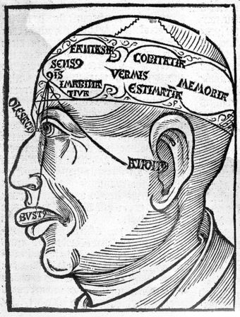
If sensory enhancements aren’t used properly, they can detract or distract from a presentation.
Awakening the Senses
Sensory enhancements are good in presentations, but they can be a distraction if they aren’t used correctly.
Visual Missteps
The famous psychologist Albert Mehrabian showed that the way people take in information during a presentation is 55% visual, compared to 38% vocal and only 7% through text. Yet simply adding a few visuals into a presentation may not be the solution. There are a number of traps that people fall into.
- Using Bullet Points: According to research carried out at UCLA, a visual presentation is five times more likely to be remembered after three days than a presentation using bullet points.
- Corny Images: These often have actors showing emotions such as surprise or happiness. The difficulty is that they can look very corny. Additionally, if the photos are a few years old, the fashions can look very dated.
- Using Clip Art: An idea behind its time. Clip Art used to be a great way of making a presentation visual—particularly when computers were less powerful and every presentation had be small enough to fit onto a floppy disk. The problem now is that clip art looks very dated compared to a color photograph.
- Grainy Pictures: Generally these images are taken from a web page and increased in size. The problem is that, since they were saved as small files to make them load quickly, they do not enlarge well .
- Copyright Theft: It’s easy and tempting to just lift an image off the web, but you must obtain the permission of the copyright owner before you can use any image.
- Images Purely for Decoration: A picture is worth a thousand words. So why would you slap down any old image just to fill up a bit of space? Instead of an image showing how their products could suit a wide range of businesses, their graphic design agency had added a picture of a horse! Relevance is everything.
- Long Video Clips: It can be helpful to add a video clip into a visual presentation, but be aware that an audience’s attention will dwindle if the clip is too long.
Audio Missteps
If you are going to use sound in a presentation, make sure that it is appropriate to the setting and subject matter. Don’t have the audio so loud that people can’t hear the speech properly or that it distracts the audience from your speech. You should also make sure that it isn’t so soft that it can’t be heard properly by everyone in the room.
Touch Missteps
If you bring objects for the audience to touch and examine during the presentation, you will want to bring more than one item so that you can have the objects pass around the venue quickly. You’ll also want to schedule a period of time during your speech for the examination, otherwise people will be paying more attention to the object and miss important elements of the speech.
Sense Missteps
Some people are sensitive to smells, so if you are including this aspect into your presentation, make sure the scent isn’t too strong or cloying. You want to be able to enhance your speech without distracting or offending your audience.
The Important of Preparation
Preparation is the most important part of sensory enhancements. Make sure that you practice your presentation in the same room in which it will be delivered. Check acoustics, visibility, and the ability to deliver objects and scents in the room without distraction. Have people listen and experience your presentation beforehand, so you can adjust any mistakes before the final presentation and ensure that your speech goes as smoothly as possible.
16.3.3: Design Tips
Designing an effective and engaging presentation in PowerPoint or other presentation program requires simple graphics, fonts, and structure.
Learning Objective
State the design best practices that should be incorporated into PowerPoint presentations
Key Points
- Do not write your entire presentation on your PowerPoint. Rather, use bullets and sub-bullets to break up the text into manageable, easy-to-read chunks.
- Be consistent with your color themes.
- Use at least 18-point font for main points and smaller font sizes for sub-points.
- Use a font color that is readable and stands out against the background.
- Use graphics.
Key Terms
- PowerPoint
-
(noun) an electronic slide presentation created and presented using the program (verb) to communicate to (an audience) by electronic slides
- design
-
To plan and carry out (a picture, work of art, construction etc. ).
Introduction
Let’s face it. Love it or hate it, PowerPoint, or PowerPoint type slides, are the most common form of visual aid seen during a presentation. We all know that we have encountered boring power points presentations with an overload of information and lack of creativity. Developed by Microsoft, PowerPoint is a presentation software that enables users to communicate text, graphics, video, and other content via electronic slides.
The following design tips can help users develop effective PowerPoint presentations, while keeping in mind PowerPoint etiquette.

PowerPoint Presentation
Using software, like PowerPoint, allows the speaker to create an engaging presentation.
PowerPoint Tips
- Do not write the entire presentation on your PowerPoint. Instead, create bullet points and headings no longer than three to five words that give the main points.
- Present no more than five to seven lines per slide.
- Use two slides rather than cramming too much information into one.
- Be consistent with your “theme” throughout the presentation (i.e., do not use a different theme for each slide).
- Do not overuse transitions. They are meant to enhance, not overwhelm your presentation.
- Be careful with your color scheme. Again, this is meant to enhance your presentation. Make sure the audience can read the text.
- Make an outline of what you will be talking about so listeners can know what to expect from the presentation.
- Use at least an 18-point font for main points and a smaller sized font for sub-points. Avoid using complicated and unreadable font.
- Use a font color that stands out against the background.
Easy-to-Read Text and Graphics
Use graphics! People identify items more quickly with images rather than just text alone. When creating your visual aids, however, make sure your text and graphics are readable.
Labeling
- Use headlines and sub-headlines in a larger font.
- Bold, italicize, or CAPITALIZE important information.
- Use bullet points or create lists to organize material. Make sure this is “nice” to look at (i.e., easy-to-read).
Charts and graphs
- Make sure the information is clear and supports your presentation. Color coordinate charts/graphs if necessary.
- Use text to support/explain your charts and graphs (be brief but cover the high points).
- Avoid charts and graphs that can be misleading to your readers.
Wording and Lettering
- Use large, easy-to-read fonts.
- Be concise, using as little text as possible. Also use simple language to avoid confusion.
- Limit your text to one or two fonts.
- Think of the demographic (e.g., age) of your audience when setting font size and type.
- Minimize the number of lines to no more than six lines per slide with six words per line.
→Overcrowding slides is common and can be easily avoided by limiting the amount of text.
Color
- Use color for clarity and emphasis, not for decoration.
- Use color schemes.
- Keep a similar color scheme throughout the entire presentation.
- Use contracting colors to highlight main points.
16.3.4: The Role of Color
When properly used color should draw attention to the important terms or concepts in your presentation.
Learning Objective
Describe how color can be used to enhance presentations
Key Points
- One of the disadvantages of using color is that individuals who are colorblind may miss out on some information in certain colors.
- Do not “waste” information by using unnecessary colors.
- It may also be useful to apply some color psychology when choosing which colors to use.
Key Term
- color-blind
-
Of a person or animal, unable to distinguish between two or more primary colors (usually red and green).
Introduction
When properly used color should draw attention to the important terms or concepts in your presentation. They can also create emotion. Color should be consistently used throughout the design of the visuals to achieve these goals.
Learners and audiences are more attracted to colors and may find presentations without color to be boring. Some presenters change up their color schemes regularly to prevent their presentations from becoming too monotonous. You can also change the shades of your colors.

Using Color Effectively
Color can be used in a presentation to get the audience’s attention.
One disadvantage of using color is that individuals who are color-blind may miss out on some information in certain colors. Using certain shades, and using them consistently, can eliminate this problem.
Useful Suggestions for Using Color
- Be consistent with the use of colors.
- Use color to highlight a difference or change.
- Try to keep color use to a minimum; each color should communicate necessary information.
- Make sure that there is a good contrast between the background and the color of the text to allow the learner to read the text easily.
- Use color for clarity and emphasis, not for decoration.
The Psychology of Colors
It may also be useful to apply some color psychology when choosing which colors to use. Basic internet research uncovers a whole host of analysis on the meanings of different colors.
Something else to consider is that on flip charts, blue, black, and green inks have the best visibility. People say that blue is the most pleasing color to view. Red comes in second, even though it is not the most visible. But too much red can be too strong. Avoid using purple, yellow, pink, and brown, which can be more difficult to see.
When creating graphs, bright colors will bring focus to a small graph while subtle colors will keep a large graph from overwhelming the audience.
16.4: Presenting with Sensory Enhancements
16.4.1: The Do’s of Using Visual Aids
Visual aids should be easily understood, aesthetically pleasing, easy to move, easily seen and heard, and act as a supplement to the speech.
Learning Objective
List best practices for presenting visual aids in a speech
Key Points
- Presentation aids must be easily understood by the audience. Graphic elements should be large enough to be easily seen and/or read.
- Presentation aids must be easy to transport. In addition, you should make sure you know to use presentation equipment ahead of time.
- The design of your presentation should not detract from the content of your speech.
- Consider whether you can understand if each visual aid is addressing and furthering the key point of your presentation.
- Visual aids are useful to help the audience better understand your topic if they are used as a supplement to your presentation.
Key Terms
- extraneous
-
Not essential or intrinsic.
- verbatim
-
A word-for-word report of a speech.
Visual aids are essential to helping your audience better understand the key points of your presentation. Visual aids will also help to improve the attention span of audience members during the presentation. However, it is important that presenters use visual aids in a manner that does not distract from the overall presentation. An effective visual aid will include the following attributes:
- Easily seen or heard by the audience
- Easily handled
- Aesthetically pleasing
- Easy to understand the key point
- Act as a supplement to the speaker’s message and not a replacement
Easily Seen or Heard by the Audience
Presentation aids must be easily understood by the audience, even those sitting at the very back of the room. Graphic elements in presentation aids must be large enough to be easily seen and/or read. Similarly, audio elements must be loud enough to hear.
Easily Handled
Your presentation aids should be easy to transport. In addition, you should make sure you know how to use presentation equipment ahead of time. You should seamlessly incorporate presentation aids into your speech. You don’t want your audience to be distracted by these elements.
Aesthetically Pleasing
Your visual aids should not detract from the content of your speech. Keep your presentation simple so people can focus on the content rather than the aesthetics. The decisions you make when you design your visual aids should be very deliberate. If you add color to a visual aid, for example, use it for a clear purpose.

PowerPoint Presentation
The
audience should be able to quickly understand the key point of each slide in a PowerPoint presentation.
Easy to Understand the Key Point
If your PowerPoint slides or handouts have too much extraneous information, then the audience may not be able to understand the takeaway message of the presentation. A way to test if your visual aids are addressing the key point is to ask someone who is unfamiliar with your presentation if they can understand what the key point is. If they cannot determine the key point, it may be a good idea to revise your visual aids to include less non-essential information.
Supplement not Replace, the Presentation
Visual aids are useful to help the audience better understand your topic if they are used as a supplement to, and not a replacement for, your presentation. For example, a visual aid that replaces a presentation could be a PowerPoint that includes big blocks of text that the presenter reads verbatim. While this will be an accurate presentation, it will likely bore the audience members who will not gain much from the presentation. However, if the visual aid acts as a supplement, it will enhance the audience member’s understanding through diagrams, graphs, charts, and summaries.
16.4.2: The Don’ts of Using Visual Aids
Some “don’ts” of visual aids include inconsistent themes, small fonts, too much information, and distracting noises and animation.
Learning Objective
Discuss the missteps presenters should avoid when using visual aids
Key Points
- If your visual aid has inconsistencies in color scheme or theme, the audience may become confused since color change may indicate a change in topic.
- Avoiding small font is essential to making sure that the audience can read your visual aids. A general standard is to make sure that all PowerPoint slides are at least 18-point font to ensure that audience members in the back row will be able to read your presentation.
- Try to keep the amount of information on each slide to a minimum and use only what is necessary to convey the key point of the visual aid or slide.
- Avoid distracting animation and noises. These will take the focus of the audience away from your presentation and shift it toward the noise or animation instead.
Key Term
- Detract
-
Take away the value of.
Visual aids can be effective at enhancing your presentation and helping the audience better understand the key points of your presentation. However, if visual aids do not help your message or are too confusing, they may actually detract from the presentation and hinder understanding. Some key “don’ts” of using visual aids include:
- Inconsistency in color scheme or theme
- Small or complicated font or overwhelming text or graphics
- Too much information or too many slides
- Distracting animation or noises
Inconsistency in Color Scheme or Theme
If your visual aid has inconsistencies in color scheme or theme, the audience may become confused since color change may indicate a change in topic. Consistency in theme and color will help coordinate all of the information in your presentation and will help the audience understand the topics in relation to one another. There are a number of default themes that Microsoft PowerPoint offers that can help unify your color scheme and theme.
Small or Complicated Font or Overwhelming Text and Graphics
Avoiding small font is essential to making sure that the audience can read your visual aids. A general standard is to make sure that all PowerPoint slides are at least 18-point font to ensure that audience members in the back row will be able to read your presentation. Additionally, you should avoid overwhelming text and graphics as they will distract from the main topics and points of your presentation.

Complicated Graphics
The speaker should avoid using complicated graphics in a presentation.
Too Much Information or Too Many Slides
Try to keep the amount of information on each slide to a minimum and use only what is necessary to convey the key point of the visual aid or slide. Additionally, try to keep the number of slides or visual aids in your presentation to a minimum. A rule of thumb is to use each slide in a PowerPoint for 30 seconds to a minute of your presentation. Remember that the majority of your presentation should come across in what you are speaking about rather than through the text on your visual aids.
Distracting Animation or Noises
Avoid distracting animation and noises. These will take the focus of the audience away from your presentation and shift it toward the noise or animation instead.
16.5: Using PowerPoint and Alternatives Successfully
16.5.1: The Advantages and Disadvantages of PowerPoint
PowerPoint is a quick and easy way to organize ideas and information, but can encourage the creation of presentations that lack substance.
Learning Objective
Name the advantages and disadvantages of using PowerPoint
Key Points
- PowerPoint is regarded as the most useful, accessible way to create and present visual aids; others believe it has its own mind-set which forces presenters to spend countless hours thinking in PowerPoint and developing slides.
- Advantage—easy to create colorful, attractive designs using the standard templates and themes; easy to modify compared to other visual aids, such as charts, and easy to drag and drop slides to re-order presentation.
- Advantage—easy to present and maintain eye contact with a large audience by simply advancing the slides with a keystroke, eliminating the need for handouts to follow the message.
- Disadvantage—speakers create slides so they have something to present rather than outlining, organizing, and focusing on their message.
- Disadvantage—the linear nature of PowerPoint slides forces the presenter to reduce complex subjects to a set of bullet items which are too weak to support decision-making or show the complexity of an issue.
- Disadvantage—basic equipment required to present. You will need to have a computer and projection equipment in place to display the slides to the audience.
Key Terms
- PowerPoint
-
(noun) an electronic slide presentation created and presented using the program (verb) to communicate to (an audience) by electronic slides
- bullet points
-
Bulleted items – known as bullet points – may be short phrases, single sentences, or of paragraph length; used to introduce items in a list.
Advantages and Disadvantages of PowerPoint
PowerPoint—Advantage or Disadvantage for the Presenter?
PowerPoint is the most popular presentation software. It is regarded by many as the most useful and accessible way to create and present visual aids to the audience.
On the other hand, others believe it has created its own mind-set which forces presenters to spend countless hours thinking in PowerPoint and developing slides. A political party has even formed to ban PowerPoint in Switzerland. Depending on one’s perspective, it seems that many advantages could easily be viewed as disadvantages.
Using PowerPoint
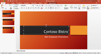
When used correctly, PowerPoint is a helpful program for creating an engaging presentation.
Look over the list below to see where you stand—with or against PowerPoint.
Advantages
Design
- Quick and easy: the basic features are easy to master and can make you appear to be organized, even if you are not.
- Simple bullet points: it can reduce complicated messages to simple bullet points. Bullet points are a good basis for a presentation and remind the speaker of main points and the organization of the message.
- Easy to create a colorful, attractive design: using the standard templates and themes, you can create something visually appealing,even if you do not have much knowledge of basic graphic design principles .
- Easy to modify: when compared to other visual aids such as charts, posters, or objects, it is easy to modify.
- Easily re-order presentation: with a simple drag and drop or using key strokes, you can move slides to re-order the presentation.
Finally, PowerPoint is integrated with other products that allow you to include parts of documents, spread sheets, and graphics.
Delivery
- Audience Size: PowerPoint slides are generally easier to see by a large audience when projected than other visual aids.
- Easy to present: you can easily advance the slides in the presentation one after another with a simple key stroke while still maintaining eye contact with the audience.
- No need for Handouts: they look good visually and can be easily read if you have a projector and screen that is large enough for the entire room.
Disadvantages
Design
- Design power pointless: gives the illusion of content and coherence, when in fact there is really not much substance or connection between the different points on the slides.
- PowerPoint excess: some speakers create presentations so they have slides to present rather than outlining, organizing, and focusing on the message.
- Replaces planning and preparation: PowerPoint is a convenient prop for poor speakers, as it can reduce complicated messages to simple bullet points and elevates style over substance.
- Oversimplification of topic: the linear nature of PowerPoint forces the presenter to reduce complex subjects to a set of bullet items that are too weak to support decision-making or show the complexity of an issue.
- Feature abundance: while the basic features are easy to use and apply, a speaker can get carried away and try to use all the features at once rather than simply supporting a message. Too many flying letters, animations, and sound effects without seeing much original thought or analysis can be a real issue. In many cases, the medium shoves the message aside.
Delivery
- Basic equipment required: you will need to have a computer and projection equipment in place to display the slides to the audience.
- Focus on medium, not message: Too many people forget that they are making a presentation first and that PowerPoint is just a tool.
16.5.2: An Overview of PowerPoint
Microsoft PowerPoint is a computer software package that displays information in the form of a slide show.
Learning Objective
State the arguments for and against using PowerPoint as a visual aid
Key Points
- PowerPoint presentations consist of a number of individual pages or “slides,” with individual slides containing text, graphics, sound, video, or other objects that can be arranged by the presenter.
- A PowerPoint presentation can be automatically controlled by pre-programming transitions from one slide to another, or manually controlled by a user.
- Supporters of PowerPoint say the presentation software is easy to use and can save a lot of time for by replacing the need for a variety of different visual aids.
- Some opponents of PowerPoint argue that the program encourages the reduction of complex ideas into simplified points, while others contend that the program encourages overstuffing presentations with too much information, both of which negatively effect the audience’s experience.
Key Term
- PowerPoint
-
(noun) an electronic slide presentation created and presented using the program (verb) to communicate to (an audience) by electronic slides
An Overview of PowerPoint
PowerPoint is a presentation software program . A presentation program (also called a presentation graphics program) is a computer software package used to display information, normally in the form of a slide show. It typically includes three major functions: an editor that allows text to be inserted and formatted, a method for inserting and manipulating graphic images, and a slide-show system to display the content.

PowerPoint
PowerPoint software runs on Microsoft and Mac operating systems. It allows users to
create visual presentations comprised of individual slides.
Microsoft PowerPoint 9 is easy-to-use presentation software that runs on Microsoft Windows and Mac OS operating systems. PowerPoint is commonly used by business people and students to create slide show presentations. The ease of use is demonstrated by the fact that the program can be used by junior high and high school students. PowerPoint can accommodate a range of uses, with intermediate to more technical options. Microsoft estimates that thirty million presentations are made each day using the PowerPoint program. As of 2012, various versions of PowerPoint claim approximately 95% of the presentation software market share, having been installed on at least 1 billion computers.
PowerPoint Logo
With 95% market share, PowerPoint presentation software is one of the most widely used programs for developing visual presentations.
PowerPoint has almost become a generic term similar to Xerox or Coke or Google and is often used when one is referring to any computer supported presentation, thus demonstrating how ubiquitous the program has become.
The Use of Slides in PowerPoint Presentations
PowerPoint presentations are comprised of a number of individual pages, or “slides. ” The “slide” analogy is a reference to slide projectors. Unlike slide projectors however, which only projected static images, slides in PowerPoint are more dynamic. They can include text, graphics, sound, movies, and other objects, which can be arranged by the presenter. The PowerPoint presentation can be printed, displayed live on a computer, or navigated through at the command of the presenter. For larger audiences the computer display is often projected using projection equipment. The slides can also be used as the basis for a webcast.
After designing the individual slides for your presentation, you can control the presentation by pre-programming the transitions from one slide to another with the exact timing you want. Or, you can advance the slides manually as you speak about each.
Supporters and Critics
Supporters of the software say the PowerPoint can save people time by circumventing the need for other types of visual aids, such as hand-drawn or mechanically typeset slides, blackboards, whiteboards, or overhead projections. Because the software is easy to use, it encourages people to give presentations that contain visual aids who otherwise may not have even given a presentation.
PowerPoint does have its critics, and the benefits of the software are continually debated. Some critics of PowerPoint argue that condensing complex issues into simplified bullet points is detrimental, and compromises the quality of information provided to the audience. This view finds that audience do not receive enough detailed information to make informed decisions about presentation topics. Additionally, there are also some critics who say that rather than providing too little information, PowerPoint allows users to put too much information into presentations. This can lead to “death by PowerPoint,” which is a state of bordem or fatigue as a result of sitting through a presentation that contains too much information.
As is clear from the debate about its merits, PowerPoint can present many benefits and challenges to a user who develops a slideshow to accompany a speech or presentation.
16.5.3: The Elements of a Slide
PowerPoint is a multi-media platform that incorporates elements of written, audio, video, and graphical communication.
Learning Objective
Break down the elements that comprise a PowerPoint slide
Key Points
- The most basic element of a PowerPoint presentation is the slide.
- Slides are comprised of a combination of textual and visual elements.
- Text may be organized as captions, paragraphs, or bulleted points.
- Add graphics such as shapes, pictures stored on your computer, pictures retrieved online, and charts or tables from other programs such as Excel.
- To add video clips, search for them from within the PowerPoint platform using Bing, Flickr, and Youtube, and import them directly into a slide.
Key Term
- slide
-
A single page of a presentation, developed using a presentation program such as Microsoft PowerPoint. Collectively, a group of slides may be known as a slide deck or slide show.
Elements of a Slide
The basic element of the presentation is the slide. The new default aspect ratio of the slide is 16:9 for wide screens, but the previous aspect of 4:3 is still available. Some basic example elements used to compose a slide are as follows:
Titles and sub-titles: After first opening PowerPoint to start a new presentation using the Blank Presentation Template, the user can select a title and sub-title for the presentation, using one of a variety of fonts and colors.
Text: Users can enter the content as bullets on the slide along with a title for the slide. They can also select the font style, size, and content to support their message.
Shapes: PowerPoint can merge two shapes together to create a custom shape.
Pictures: Users can search for and insert their own photographs. Remember to re-size the photo to fit the slide.
Charts/Graphs: Create custom charts or move relevant charts from Excel spreadsheets.
Audio/Video Clips: Download videos, images, and audio files directly into a slide for a presentation without first downloading to the computer. Search for audio and video from within PowerPoint to find images using Bing or Flickr and videos on You Tube. After locating the desired supporting media, incorporate it into the slide. By default, the results show images that are licensed under Creative Common, so the images can be used in presentations without violating an owner’s copyright, but users can also view all results.
Transitions: Transitions move the presentation gracefully from one slide to the next or build the side dynamically. There are many standard transitions available, or users can program their own special effects to animate the movement of the sides.
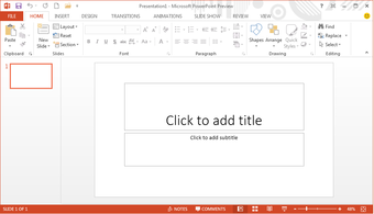
PowerPoint Slide
PowerPoint allows users to create slides and add animation, transitions, and video and audio clips.
16.5.4: Formatting Tips
Formatting choices, including layout, font selection, transitions and use of space and color, are important components of a presentation.
Learning Objective
Give examples of how to best format a PowerPoint presentation
Key Points
- The blank template provides an initial format that allows a user to clearly distinguish main points from subpoints and supporting material.
- In the body of a slide, use keywords and phrases instead of sentences as listed bullet items to help the audience skim the slide and see relationships between main and sub-points.
- Insert and re-size visuals such as WordArt, shapes, charts, graphs, images, or pictures from your own computer or from the internet, into a slide to provide support for claims.
- Audio and video clips of a high quality not only clarify or provide support an idea, but also improve the quality of a presentation. Avoid videos with low resolution or poor quality audio clips, as they may affect audience perception.
- When using effects to transition from one slide to another, avoid slow moving or fancy effects such as crawl in, swivel and spiral. Don’t overuse special effects and keep transition choices consistent.
- After the Presentation – you can format and export your slides to a Word Document for handouts or share by email, pdf, or internet.
Key Term
- Placeholder
-
dotted or hatch-marked borders for entering text, charts, tables, or images on a slide.
PowerPoint Features
PowerPoint incorporates elements of written, oral, and visual communication. By focusing on decisions regarding blank space or color, contrast, and font, you can design a presentation that is not only aesthetically appealing, but also enhances and underscores key content and objectives. The following tips will help you and your audience get the most from your presentation.
Formatting the Slide
Templates: You may either select an existing template or design your own. The blank template allows you to modify colors, themes, and the style of different elements to best suit your needs.
Normal view – Blank Presentation template: The blank presentation template provides placeholders for title and sub-title on the first slide, and additional placeholders for the title on each blank slide. This allows you to distinguish your main points from sub-points. Follow basic design rules:
- Use blank space to group or separate items.
- Use visual balance to please the eye.
- Create contrast to make objects stand out. Contrast occurs when any two elements are different.
Colors: Choose colors so that text is clearly legible. In addition, consider how the colors will look in the space where the slideshow will be presented. For example:
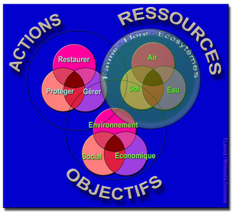
Picking Colors
In a presentation, there can be different colors and fonts, but all of the text must be easy to read for the audience.
- Strong light reduces contrast on dark background.
- In a well-lit room, use light background with dark text and visuals.
- In a dimly-lit room, use dark background with light text and visuals.
- Avoid vibrating colors. Bright complementary colors that are close to each other in intensity “vibrate” or reduce legibility.
Adding Content
Text: Use text properly.
- Use keywords and phrases instead of sentences.
- Be consistent in your use of capitalization.
- Put similar ideas in the same formatting by using the same parts of speech, same clauses, phrases, or all complete sentences.
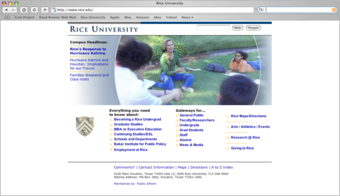
Organization
On a slide, information can be organized using bullet points or lists.
- Use bullet points. Bullets help the audience skim the slide and see relationships between main and sub-points. Here is how to use bullets:
- Select the “bulleted list” or “two-column list” slide (from the pre-designed slide formats).
- Type a phrase then hit “return.”
- Type a second phrase, hit “return” then hit “tab” to indent.
- OR use “promote” or “demote” arrows at top to create a bulleted hierarchy, in order to distinguish main claims from subclaims.

Creating a Contrast
A speaker can create contrast in a presentation changing the font, color, or size.
Fonts: Choose easy-to-read fonts.
- Select fonts that are good for projecting, not ones that are just good for printing.
- Pay attention to the legibility of the font you choose, such as the contrast between background and text, size of the font, and any type treatment such as shadowing that may reduce legibility.
Graphics: Insert needed visuals such as WordArt, shapes, or images. Make sure to re-size the images to best fit the slide. Here is how to re-size images:
- Click on the visual you wish to resize.
- Go to “format” and then “object” or “autoshape.”
- Select “size.”
- Change size and scale.
- OR, simply click and drag the corners of the image.
- You can also combine two different shapes by selecting one and then selecting and dragging another into it for a custom image.
Video and Audio: You can search and select video in different media formats. Just click to select the video/audio and insert where you want them to play on the slide. You can also record your own audio to add to a slide. When choosing video or audio to add to your presentation, make sure that it is of a high quality. This enhances the authority of the presenter as well as improves audience receptivity.
Moving Between Slides
Effects and transitions: PowerPoint comes with a preset collection of transitions. You can choose different types of transitions to move between slides. Newer versions of PowerPoint even have some 3D transitions. In addition, there are many free transition templates available from Microsoft and open sources.
Effects between slides: Effects should have a point and support the overall concept of the presentation. Avoid slow moving or fancy effects such as crawl in, swivel, and spiral. Don’t overuse special effects as they can distract your audience from your main points. To avoid this from happening, keep effects and transitions consistent.
After the Presentation
Handouts: You can export your PowerPoint presentation to a Word Document. When you do this, there are different choices available for how slides and notes are positioned. In the latest version of PowerPoint you can go to File—-> Export and then click on the {Create Handouts} button. Your presentation will then be exported to a Word document for formatting.
Share: You can also share your PowerPoint presentation by email, through web access. or publish your slides so that others can access them electronically rather than having to distribute handouts.
16.5.5: Delivery Tips
PowerPoint presentation software is your assistant and should help you by supporting your presentation, not taking over the show.
Learning Objective
Illustrate how PowerPoint features can be used to communicate to audiences
Key Points
- Rehearse the show to see what it will really look like when it is presented to an audience; try controlling the movement from one slide to next or preprogramming the amount of time for each slide to appear on the screen.
- The content of the slides serves as a guide or outline for you and the audience, so you want to make sure you talk about each slide, not read the content to the audience who can read what is projected.
- Presenter View allows you to see your notes on your monitor while the audience only sees the slide. While you move from one slide to the next you can also zoom in on a particular part of the slide or use a pen or laser pointer to call attention to specific details.
- Relational presentation practitioners structure small message units that are rather self-contained and can be pulled together as the speaker interacts with the audience.
Key Terms
- Relational
-
A type of interactive presentation using presentation software that is structured to allow dynamic customization of the message while presenting.
- linear
-
Pertaining to or resembling a line; step-by-step in order.
PowerPoint Software Is Your Assistant
PowerPoint presentation software is your assistant and should help you, not take over the show. Nothing can substitute for a carefully prepared message, whether that message is a standard linear message or a relational interactive message. The delivery of the message is guided by the best practices that you have been using throughout your speeches; however, there are some special considerations when working with PowerPoint.
Practice and Rehearsal
After putting together a PowerPoint slide show, you will want to get a “reality check” by actually running the show to see what it will look like when you present it. You may control the movement from one slide to the next as you speak, or you may preprogram the amount of time that each slide appears on the screen and speak only for that amount of time.
If at all possible, rehearse with the same display equipment in a similar space. If you are speaking to a colocated audience, make sure that your projected slides are large enough for all members of the audience to see (usually about 1 inch high for each 10 feet that separates the audience from the projected slide). Additionally, if you are speaking to a remote audience, check your display so that you can see the presentation in the same way that the audience will see it on their screens.
Basic Delivery
One critical aspect of delivery is avoiding the temptation to read the content to the audience; the audience can read what is projected themselves. The content of the slides serves as a guide or outline for you and the audience. Stand to the left of the screen . For the English speaker who reads from left to right, the audience will see you as their eyes move across the screen in one continuous left to right eye movement. And remember to speak WITH the audience, not AT them .
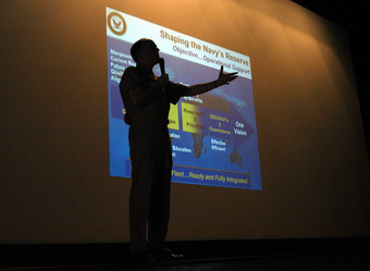
Delivering a Speech
The speaker delivers the speech with assistance from PowerPoint slides in the background.
Using Views
Using PowerPoint Views allows you to follow a linear path or relational interactive paths for delivery.
Slide Show View
You can use the Slide Show view to deliver your presentation. The slide occupies the full screen and displays the way your presentation will look when you project it. You can use the Slide Show view to see the slide show on your computer screen one slide at a time. You can move to the next slide by clicking the mouse or using the up and down arrow keys.
Presenter View
You can see your notes on your monitor while the audience only sees the slide. You can also zoom in on a particular part of the slide or use a pen or laser pointer to call attention to details. In Presenter view, you can display the current slide on the left side, the next slide on the right, and the notes at the bottom right of the screen.
Interactive Relational Delivery
Relational presentation (also known as visually interactive presentation) uses standard presentation software such as PowerPoint in a way that allows for dynamic customization of messages while presenting.
Relational presentation practitioners structure their material using a combination of strategies to develop and access small message units. Each small message unit is rather self-contained and can be pulled together as the speaker interacts with the audience. While presenting, you interact with the audience rather than “talk at” them. You can use the Presenter view to quickly select and navigate to each message unit spontaneously within and between collections of interconnected shows. Some of these navigation devices use text links and others incorporate picture thumbnails or miniature screenshots as link sources.
Navigation in a Presentation
Whether you are delivering a traditional, linear message or an interactive, relational presentation, it is helpful to gain control of the basic movements for the slide show.
Interact with the Audience
It’s important that the speaker maintains eye contact with the audience while projecting the slides.
Move to the last slide: Drag the scroll box to the bottom of the scroll bar or press [Ctrl] and [End]
Move to the first slide: Drag the scroll box to the top of the scroll bar or press [Ctrl] and [Home]
Move to the next slide: Click in the scroll bar below the scroll box or press [Page Down]
Move to the previous slide: Click in the scroll bar above the scroll box or press [Page Up]
Move to a specific slide: Drag the scroll box up or down until you displays the slide you want
Delivery Wrap-Up
So to wrap it up, you should prepare your lecture before firing up your software. Remember that the technology is your assistant and should help you, not take over the show. You may creatively deliver a linear presentation, but you can also use PowerPoint to craft a highly interactive relationship experience with the audience.
16.5.6: Other Presentation Software Options
Microsoft PowerPoint dominates the presentation software market, but other options include Mind Maps, SlideRocket, and Prezi.
Learning Objective
Describe the different software programs available as an alternative to PowerPoint
Key Points
- Presentation software’s three major functions: an editor allowing text to be inserted and formatted; a method for inserting and manipulating graphic images; and a slide-show system to display the content.
- Mind Maps break away from the linear format by using graphic symbols to show connections between different ideas.
- SlideRocket is an online presentation platform that lets users create, manage, share and measure presentations.
- Prezi is a free, web- based application allowing users to create visual presentations by zooming in, out and around a visual work space.
- Google Docs is a free SaaS part of Google Drive, and includes its own presentation software.
- There is a move at present away from traditional presentation software towards mobile-friendly solutions developed for tablets and smartphones such as Haiku Deck or Explain Everywhere.
Key Term
- Presentation Software
-
A computer software package used to display information; typically includes text editor, method for inserting and manipulating graphic images and a slide show system to display content
Alternatives to PowerPoint Presentation Software
Presentation software is a computer software package used to display information, normally in the form of a slide show. The software typically includes three major functions:
- an editor that allows text to be inserted and formatted;
- a method for inserting and manipulating graphic images, and;
- a slide-show system to display the content.
Microsoft PowerPoint dominates the market with 95% of the presentation software market share. However, there are other presentation graphic programs with different features and approaches. Some of the alternatives to PowerPoint include:
Mind Maps You can use mind maps to plan and modify your presentation. Mind Maps break away from the linear format of PowerPoint by using graphic symbols to show connections between different ideas, allowing the presenter to show a top level map and then drill down to show details for different connecting ideas. For presentation slides, you can start with a general, top level map and then create additional slides to drill down to the subtopics. You can summarize the sub points and then go back to the main, top-level mind map to show the connection to the whole.
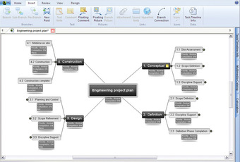
Mind Map Software
A graphic and conceptual layout that can be used for non-linear presentation.
SlideRocket is an online presentation platform that lets users create, manage, share and measure presentations. SlideRocket is provided via a monthly SaaS model or an annual subscription plan. You can also import your PowerPoint presentations or Google Presenter presentations into SlideRocket.
Users initially sign up for a free 14-day trial then decide which plan to subscribe to. Users can also use a free, basic version of the software. In addition, SlideRocket premiered the presentation resume with a variety of templates for users to promote themselves to different companies.
Prezi is a free application which allows you to create visual presentations by zooming in, out and around your visual workspace.Instead of individual slides, these ZUI’s (zoom user interface) are based on one infinite canvas on which all content is presented. This allows for non-linear presentations, richer detail of content, and a better overview of complex visual messages. Prezi also has a mobile app for tablet users.

Prezi
Prezi is web-based presentation software that uses zoom interface rather than individual slides.
Google Docs is now a part of Google Drive’s “software as a service” office suite. The free service includes it own presentation software that can be exported in open office format as well as Microsoft Office. Google Docs are automatically saved to a Google server, which prevents loss while also offering”anytime, anywhere” access.
Internet based collaboration
Another option with all these different packages is internet based collaboration. Using this method, several people revise content or review the changes as they are made by others.
